5 Signs Your Logo Needs a Re-design
Could your logo be quietly holding your brand back?
It can be hard to tell. Maybe you’ve had the same logo for years. Maybe a friend made it when you were starting out. Or maybe it was part of a package deal and you’ve just stuck with it. But over time, even a decent-looking logo can stop pulling its weight.
Your logo plays a bigger role than most people realise. It helps build recognition, creates trust, and gives your business a professional presence. And when it’s not quite right, it can quietly chip away at all those things — without you even noticing.
So how do you know if your logo is helping or holding you back?
Here are five clear signs your logo needs a redesign, and why fixing it could be one of the smartest moves you make.
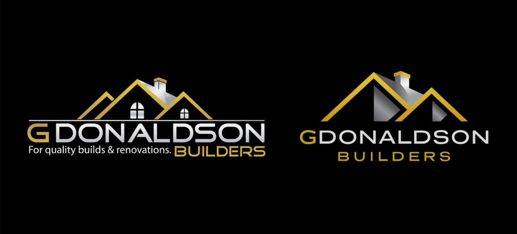
Above left is the old G Donaldson Builders logo with the refreshed version on the right. Just by changing the shape of the windows, simplifying the roofline, and updating the font, they now have a high-end, classy looking logo to appeal to a higher calibre of clients, without too much of a major change.
1. It Doesn’t Feel Quite Right Anymore
You can’t always put your finger on it, but something feels off. Maybe it doesn’t match how your business has evolved, or it feels too casual or too corporate for the kind of clients you want now. If you find yourself hesitating to use your logo or cringing when you hand out your card, trust that instinct — your brand might have outgrown it.
2. It’s Sending the Wrong Message
A logo doesn’t need to spell out exactly what you do, but it should feel like it belongs to your industry and speak to the type of clients you want to attract. If your logo looks fun and playful but you’re targeting a corporate market, or it feels too traditional for a modern, innovative business, it could be leading people in the wrong direction. First impressions matter and if your logo gives off the wrong tone, you might not even get the chance to explain what you really offer.
3. It Doesn’t Look Great Everywhere You Use It
Your logo needs to work on screens, signs, uniforms, email signatures, social media — the list goes on. If it starts looking blurry, awkward, or inconsistent in different places, that’s a sign it wasn’t built for flexibility. A modern logo should be clean, scalable, and versatile.
4. You Keep Tweaking It or Avoid Using It Altogether
If you’ve ever adjusted the colours or fonts to “make it work” in certain situations, or you avoid putting it on things because it never looks quite right, that’s a big red flag. A strong logo should be consistent, recognisable, and ready to use, not something you constantly have to work around.
5. It Gets Lost Next to Other Brands
Put your logo next to your competitors’ — does it stand out, or blend into the background? If it looks generic or lacks personality, chances are it’s not helping people remember you. A good logo doesn’t have to be loud, but it should be distinct and meaningful.
Does Your Logo Still Reflect Who You Are?
Your logo doesn’t have to be flashy or complex, but it should feel like an honest and confident representation of your business today, and not who you were five or ten years ago.
If reading through these signs has made you second-guess whether your current logo is still working, that’s okay. Most brands evolve over time, and your logo should evolve with you. Whether it needs a small refresh or a full redesign, updating your logo can help realign your brand, attract the right clients, and give you something you’re proud to stand behind.
At Merge Media, we design logos that aren’t just good-looking — they’re strategic, future-focused, and built to grow with your business.
If you’re ready to take a fresh look at your brand, Get in touch and let’s create a logo that feels right and works harder for your business.


