Your Brand Colours Say More Than You Think
When you think about your brand, what comes to mind first? Your logo? Your tagline? Maybe your website?
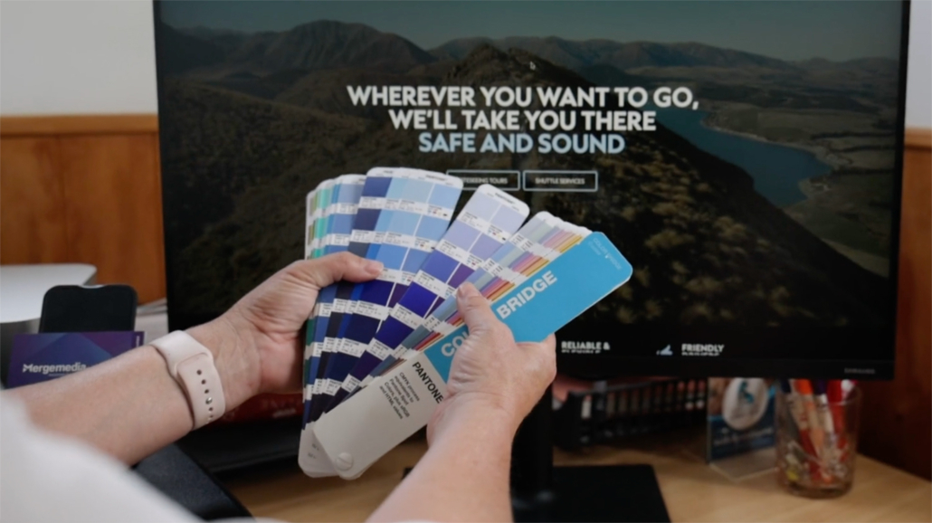
One thing that often gets overlooked is colour. But the colours you choose are doing a lot of heavy lifting behind the scenes. They shape how people feel when they interact with your business. They help tell your story, often before a single word is read.
Whether you realise it or not, your brand colours are setting a tone. The question is, are they sending the right message?
1. Colour Triggers Emotion Instantly
Before someone even reads your headline, their brain is already responding to your colours. Bright yellow might feel energetic or tradie-like. Navy feels reliable and professional. Black suggests luxury and exclusivity. Soft pastels can feel calming and friendly.
The way people feel about your colours impacts how they feel about your brand. That is why colour choice should never be random or based on personal preference alone.
Your brand isn’t just about what you like. It’s about what resonates with your ideal customer.
2. Consistency Builds Recognition and Trust
You know when you see that red and yellow combo and immediately think of McDonald’s? Or when you spot the blue and white of Facebook from a mile away?
That’s the power of consistent colour use.
When your brand colours are used consistently across your website, signage, social media, print materials, and uniforms, your business becomes easier to recognise. People begin to associate those colours with your name. Over time, it builds familiarity and trust.
But if you keep switching between shades or trying new looks every time you design something, it sends mixed messages. It can start to look messy or unprofessional, and that breaks trust before you even realise it.
3. Colours Should Reflect Who You Are
Your brand colours should reflect your personality, values, and the type of experience your clients can expect. For example, if you’re a high-end construction company that prides itself on precision and professionalism, hot pink probably isn’t the right fit.
Are you warm and approachable? Cool and clinical? Youthful and playful? Calm and natural?
Once you understand your brand personality and audience, you can choose colours that match. It’s not about guessing. It’s about creating a visual identity that feels like you and speaks directly to the people you want to attract.
4. It’s Not Too Late to Reassess
If you chose your brand colours years ago and they no longer reflect your business, it might be time to evolve.
A colour refresh doesn’t mean throwing everything out. Sometimes, it’s just a matter of adjusting the tones, refining the palette, or being more intentional about how colours are used.
At Merge Media, we can help you explore how your colours are working, what they’re saying about you, and how they can better align with your current brand strategy.
Ready to Refresh Your Brand Colours?
If your brand colours no longer feel like a good fit or you’re just not sure what message they’re sending, we’re here to help. Let’s sit down and take a look at what your colours are really saying — and whether they’re working for or against your brand.
No pressure. No design jargon. Just a relaxed conversation over coffee or a quick online catch-up.
Book a Free Chat with us today and let’s make your brand feel more like you.


