Refit Lighting
Logo, Brochure & Website Design


Logo, Brochure & Website Design
Refit Lighting needed a brand and online presence that felt clear, modern and connected to what they actually do, smarter lighting for industrial, retail and commercial spaces.
We started with the logo, using negative space to create a subtle spotlight within the design. It gave the brand a clean, professional feel, while still tying back to lighting in a simple and clever way.
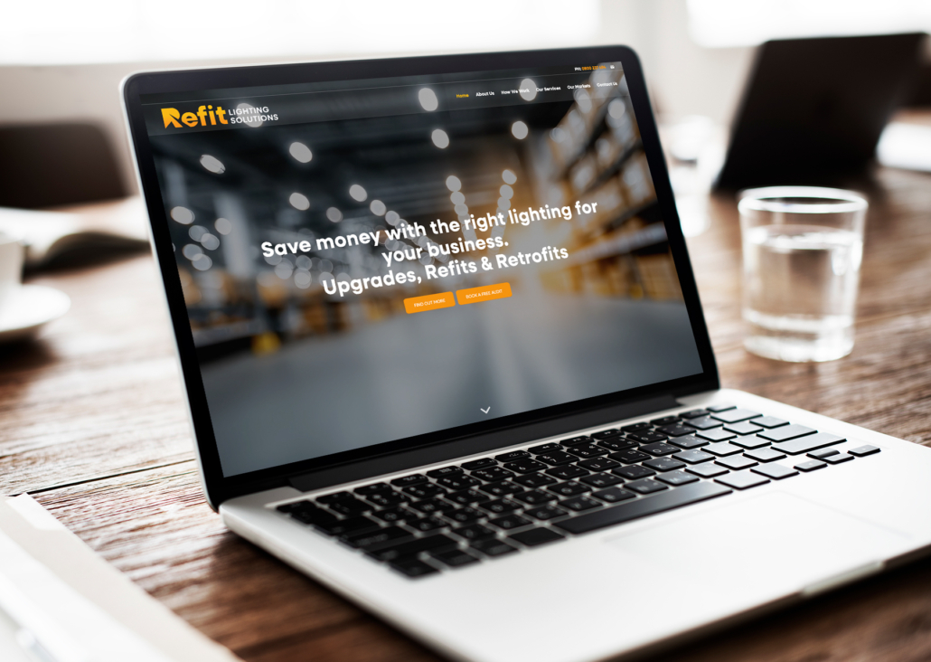
From there, we brought the new brand through into their website. The orange and blue colour palette helped create a strong visual style, while the layout kept everything clear and easy to follow. The site was designed to showcase their lighting audits, upgrades, refits and retrofits without overcomplicating the message.
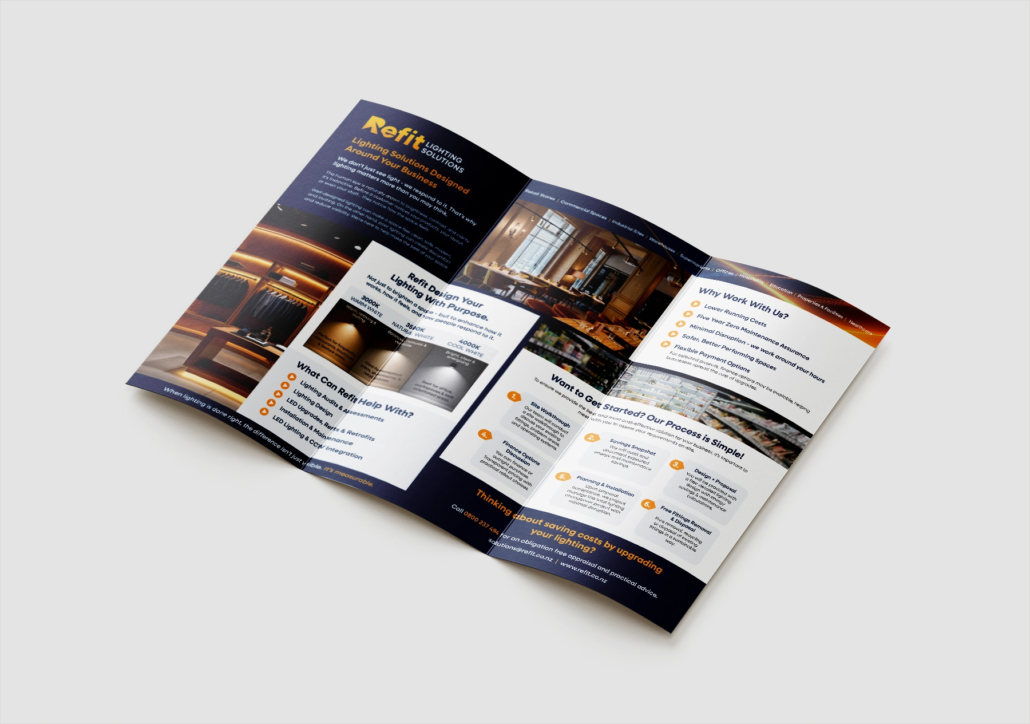
We also created a brochure, carrying the same look and feel through into print. This gave Refit Lighting a practical sales tool they could use for meetings, introductions and follow ups.
The result is a more cohesive brand presence across logo, website and brochure, giving Refit Lighting a stronger foundation to promote their services and build trust with commercial clients.
View the site here:

 NZ Ute